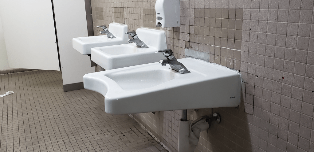
This second blog post is similar to the first blog post, except it is for a bad design I saw in campus. Right off the bat when looking at it, it seems like the design already looks off and out of place. Having a long sink then two regular size sinks, that one long one looks like it should not be there. Story time, when I first saw this sink, I tried to use it but then I could not reach it. Well, I didn’t want to reach over too much, just to wash my hands. I placed myself on that curvature part, but yet still a weird design sink. So, i just ended up using the regular size sink. Not to sure who would be using this sink, but it would make more sense to have three regular size sinks next to each other.
Another reason would be the location of this sink, right when you walk into the bathroom this long sink is placed right in front as you are walking to the stalls. Also, if you can tell in the picture, there are no mirrors where the sinks are. The mirror is placed near the wall towards the door. It would also make sense if the mirror is where you wash your hands. All in all, I believe that this whole bathroom layout is just a bad design and should be remodeled.
